Tutorial - Exploring Data
OpenExplorer's flexible visualization environment enables you to view data in ways not possible with OpenScope. For example, data from an array of channels can be organized in a pattern that simulates the channel organization on the electrodes. The flexible environment and dynamic filtering capabilities promote data exploration. You can view the activity of neurons in response to a set of stimulus conditions then quickly modify the configuration to view a Peri-Stimulus Time Histogram (PSTH) that incorporates an aggregate of the same stimulus conditions.
This tutorial will show users how to generate four standard viewing patterns in OpenExplorer:
- A channel matrix
- Stimulus and pre-stimulus histograms
- A tuning curve
- A rate-intensity curve
Getting Started
Launch OpenExplorer
To get started, launch OpenExplorer:
- On the Start menu, select TDT Sys3, OpenEx, OpenExplorer.
As you are exploring data, the data and control selection you make can be saved in an OpenExplorer configuration (*.xpr) file.
Select Data
In OpenExplorer, you can use a Tank Navigator, similar to the one found in OpenScope, to select the data you want to explore. The Tank Navigator allows you to select data from Tanks on your PC. The Tank that will be used in this tutorial includes sample data in the legacy format and was added to the registry for you during OpenExplorer installation.
Note
Before you can select data you might need to resize the sub-window so that you can read the tank and block names. To resize the Tank Navigator, drag the pane divider between the Tank Navigator and the Control Panel to the right. To see the details view, which includes information such as path and date, increase the size of the sub-window even further.
To select the data:
-
Click EXAMPLE in the TANK list then click Block-2 in the BLOCK list.
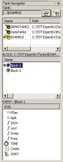
The Events in this block are displayed in the EVENT list and you are ready to build the first plot.
Channel Matrix
Multi-channel electrodes often consist of a matrix of electrodes that are in a two dimensional or even three dimensional configuration. Visualizing spike activity in a similar matrix makes it easy to identify channels with unit activity and to determine whether the same neuron is detected across several channels. In the initial Explorer configuration you'll divide the channel (CHAN) event across both axes to create a channel matrix. CHAN is a standard event. Channel information is always included in the data tank and OpenExplorer allows you to access this information without having defined a Store in OpenWorkbench.
Configure the X and Y Axes to Create a Channel Matrix
To configure the axes:
-
Click the Control Panel menu and click Add XY Axis Control.
-
In the XYAxis Configuration dialog box you can select a primary event of interest to be divided across the x and y axes. In the Primary event drop-down menu, select CHAN.
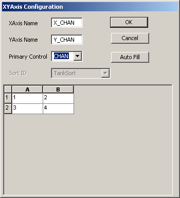
The selected block contains four channels of data. A simple 2 X 2 matrix is generated automatically. Notice that the matrix is displayed here as a spreadsheet with row labels in ascending order from top to bottom and columns ascending from left to right. When the plot is generated, the x and y axes will be generated in a typical plot format with the x-axis ascending from left to right and the y-axis ascending from bottom to top. In both displays, cell A1 contains channel one, cell B1 contains channel two, and so forth. The visual arrangement of the matrix, however, will be slightly different from what you see here.
-
Click OK.
-
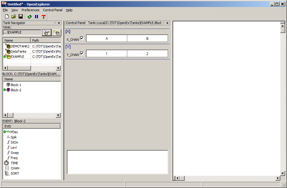
If necessary, drag the control to the [X] and [Y] area of the Control Panel.
Comparing Plot Decimated Data for Each Channel in a Scrolling Plot
In this phase of exploration you can attempt to determine how the activity is distributed across channels. One way to do this is to compare the plot decimated data for each channel in a scrolling plot.
To create the plot:
-
Drag the PDec event from the EVENT list in the Tank Navigator to the plot area.
-
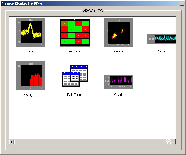
In the Choose Display window, click Scroll.
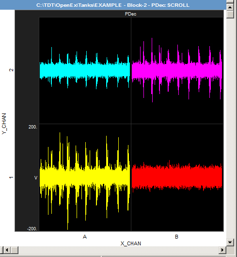
A four cell plot is generated with each cell representing a single channel. How much detail is shown and how much data is included in the scroll plot is determined by the number of scroll sections displayed along the cell's x-axis. You can adjust this and other plot parameters in the Setup Properties dialog box, which can be opened by double-clicking the plot.
Note
To adjust the plot scale, hold down the shift key and drag your mouse down.
The plot clearly shows a lot of activity in cell A1 (lower left corner). As mentioned earlier, cell A1 displays data from channel one. If you need to review which channel is in which cell, simply point to the cell to display the cell value. Further examination of the plot reveals that, although channels three and four have much less activity, the same pattern found on channel one is evident across all three channels. Channel two shows no activity.
Animating the Plot to Compare the Pattern of Activity Over Time
An animation of the scroll pattern can be used to see how tightly the spike activity on channels one, three, and four is correlated. Because you'll be comparing the pattern of activity over time, you'll use another standard event, TIME, to create the animation.
To create the animation:
-
In the Event list, drag TIME to the control panel.
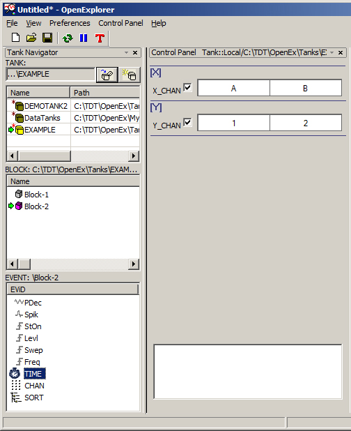
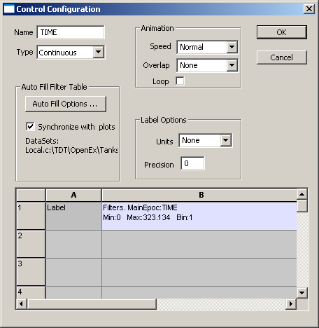
The Control Configuration dialog box opens to allow you to customize the control.
-
To accept the default control type and configuration for TIME, click OK.
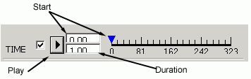
The Time control is added as a Continuous type control. This control supports the animation feature and allows you to define a duration of time to view in each animated segment. You can type a start time and duration or drag to select a time range.
-
To select a time range, either type a value in the Duration box or hold down the shift key, point to the blue arrow, and drag to the right until the desired time segment is selected.

-
Click the
 Play button to begin the animation. Each
segment of time will be animated in sequence, so that you can see the data as if you are
collecting the data in real-time. For example, if the start time is 0.00 and the duration
is 1.00, first you will see data for each channel that occurred after 0 seconds and
before 1 second. In the next frame, all data that occurred after 1 second but before 2
seconds is visible, and so on.
Play button to begin the animation. Each
segment of time will be animated in sequence, so that you can see the data as if you are
collecting the data in real-time. For example, if the start time is 0.00 and the duration
is 1.00, first you will see data for each channel that occurred after 0 seconds and
before 1 second. In the next frame, all data that occurred after 1 second but before 2
seconds is visible, and so on.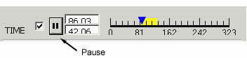
-
After animation begins, the Play button toggles to a Pause button. Click the
 Pause button to halt animation.
Comparing Spikes Across Channels
Plot Decimated Data provides a good, quick picture of activity. For a clearer picture of the neuron(s) response to a stimulus you can use a histogram to plot spike data instead. Histograms plot responses across a time epoch so you will no longer need the Time filter.
To disable the Time filter:
-
Clear the check box.

Next, you'll replace the Scroll plot of the plot decimated data with a histogram of the SPIK event.
To delete the scroll plot:
-
Right-click the plot area and click Delete Plot on the shortcut menu.
-
When you are prompted to confirm the deletion, click Yes.
To create a plot using the SPIK event:
-
Drag SPIK from the event list to the plot area.
-
Select Histogram in the Choose Display window.
Each plot type can be customized with a variety of plot property settings. In most cases default values have been defined for each setting. Histograms, however, use a time reference epoch (TimeRef Epoc) that is selected from one of the available epochs. One is chosen at random but OpenExplorer will always prompt you to confirm or change this setting. The time reference epoch is used to determine the time span and bin width for the x-axis within each histogram cell.
-
In the Setup Properties dialog box, ensure that the stimulus onset (StOn) epoch is selected in the TimeRef Epoc Name box.
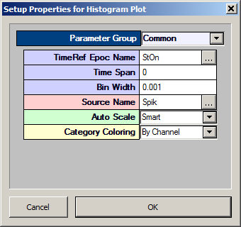
By leaving time span set to zero, you allow OpenExplorer to determine the time span and bin width automatically. Although the duration of the StOn epoch is about 50 ms, OpenExplorer will use the time span from the onset of one StOn epoch to the onset of the next StOn epoch, about 100 ms. Each bin will represent one millisecond.
-
Click OK.
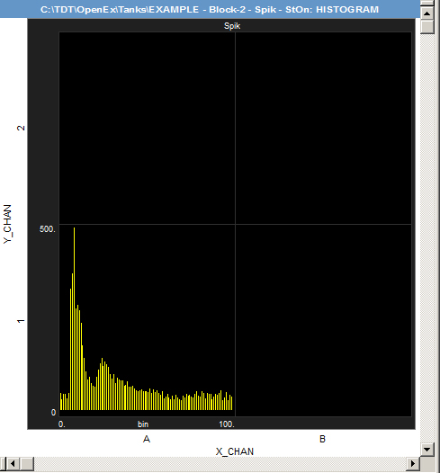
This plot clearly shows that the sorted or detected spikes show up on only one channel, channel one (Matrix A1). This probably indicates that the activity on the other channels is a result of the same neuron being recorded on multiple channels.
Note
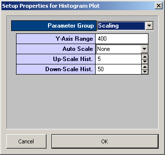
You might need to adjust the Y-axis settings to view the data correctly. Double-click on the histogram plot to open the Setup Properties dialog box. Select the Scaling Parameter Group and set the Y-Axis range to 400 for this example.
Peri-Stimulus Time Histogram (PSTH)
A channel matrix helps to identify channels of interest. In this case, the spike activity is found only on channel one. Next, you'll explore how that spike activity is related to other events, such as stimulus parameters. For this type of exploration you no longer need the channel matrix.
Removing the Channel Matrix and Filtering by Channel
To clear the Chan event from the x and y axes:
-
Clear the check boxes for the XY Axis Control.
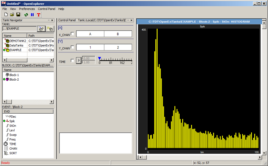
At this point, all data for the Spik event is plotted in a single histogram, using stimulus onset as the time reference epoch. Channel number can now be added as a simple filter control.
To add a filter for channel number:
-
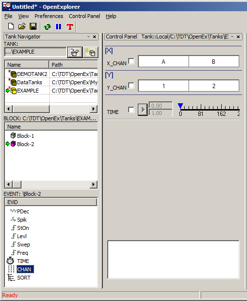
Drag the CHAN event from the Event list to the area of the control panel below the XY Axis Control.
-
A Control Configuration dialog box is opened by default. The default control type is Multi Select and the filter criteria spreadsheet is automatically filled with the available values for this event: Chan=1, Chan=2, Chan=3, and Chan=4.
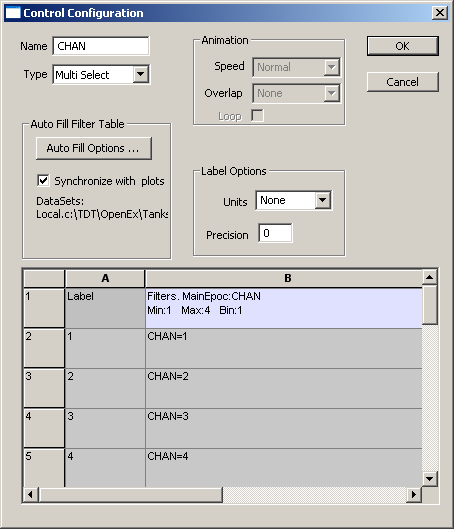
To accept the default configuration, click OK.
To filter out channels two, three, and four:
-
Click the selection box for each of these channels.

Viewing Responses by a Stimulus Parameter
During the experiment, a stimulus was presented at several frequencies. To view the spike activity at each frequency, you'll add a step slider control.
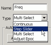
To add a new Step Slider control:
-
Drag the Freq event from the Event list to the control panel.
-
In the Control Configuration dialog box, select Step Slider from the Type drop-down menu and click OK.
-
The Step Slider control shows data for only one frequency at a time. To see what frequencies the cell responded to, you can play through the frequencies or step through the frequencies manually.
Note
In this data set, data acquired when no stimulus was being presented are sorted as Freq=0. As a result, the Freq=0 data should be disregarded or discarded.
To adjust the Y-axis settings:
-
Double-click on the histogram plot to open the Setup Properties dialog box.
-
Select the Scaling Parameter Group and set the Y-Axis range to 75.
-
Click OK.
To animate by frequency:
-
Click the
Play button in the Freq control.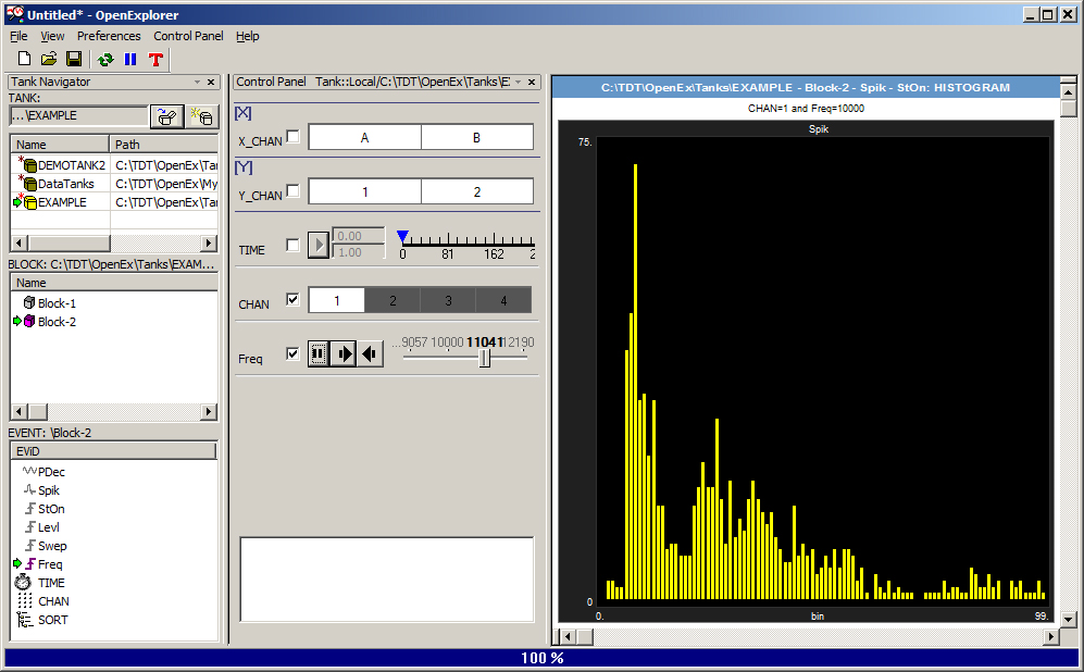
Remember that the histogram includes all intensities so you are seeing the aggregate response across all intensities for a single frequency.
-
Click the
Pause button.
To step through the frequencies:
- Drag the slider from step to step or click the corresponding arrows.
A strong response can be seen at 10 kHz. However, the response might actually occur at a lower frequency. In many cases comparing the pre-stimulus activity and activity during stimulation gives a better idea of whether or not the neuron is responding to the stimulus. To visualize the data before and after the stimulus onset, you can use the stimulus onset event with an Adjust Epoc control.
To add an Adjust Epoc control:
-
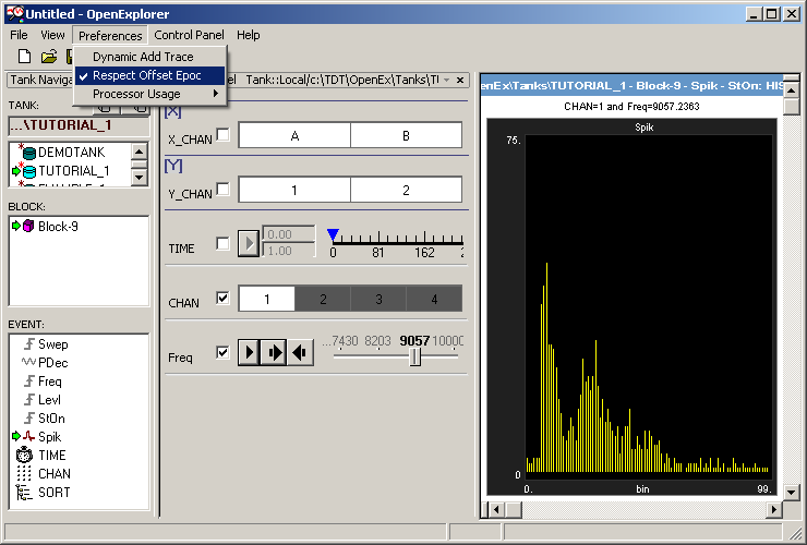
Ensure Respect Offset Epoc in the Preferences menu is enabled.
-
Drag StOn from the Event list to the Control Panel.
-
In the Control Configuration dialog box, select Adjust Epoc in the Type box.
Note
If you do not select Adjust Epoc at this stage you will have to delete the control and start again.

Initially, the control filters the data to include only responses that fall within the original epoch duration. In the plot you will now see that the x-axis extends to about 50 ms, the length of the StOn epoch.
Note
If you wish to see all data from StOn onset to StOn onset, you can set OpenExplorer to disregard the epoch duration. To disregard the epoch duration toggle Respect Offset Epoc off on the Preferences menu.
-
In the StOn control, drag the start and duration indicators to the left to change the start position of the epoch.
Note
When you drag using any point between the two blue bars, the epoch is repositioned so that a new start time is defined but the duration of the epoch is fixed (in this case about 50 milliseconds). You can also point to either bar to position it individually; however, you can never make the epoch longer than the original duration of the epoch.
When you move the slider you can get a quick idea of the pre-stimulus duration by looking at the bin number furthest to the left (in this case -9 or 9 milliseconds pre-stimulus). To enter precise offset or duration values, double-click the control to display a parameters dialog box.
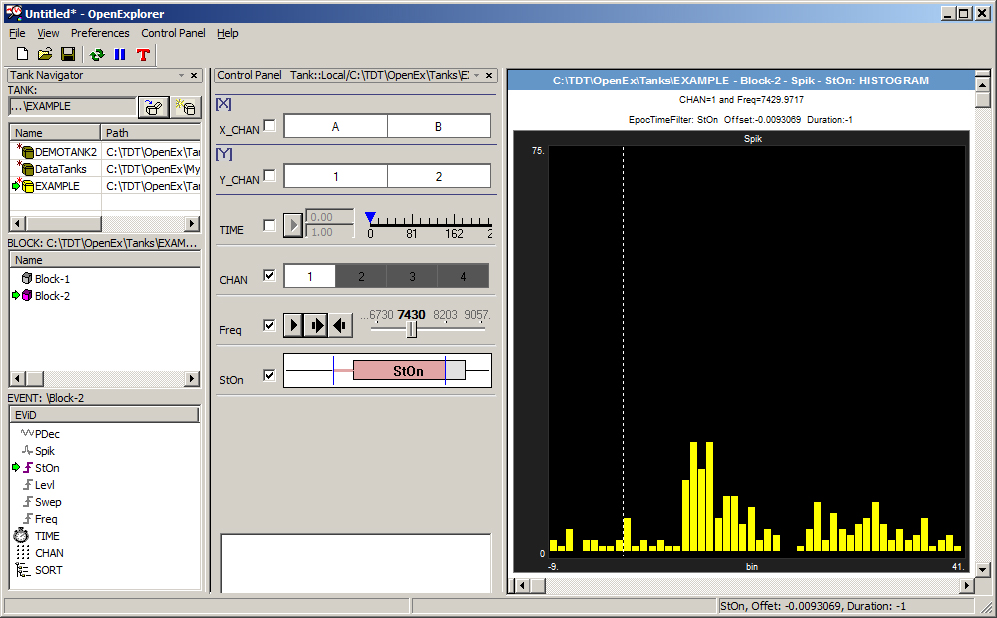
After the epoch is adjusted, a dotted white line indicates the original start of the epoch (in this case, stimulus onset). Bins that occurred before the onset are negative, bins after the onset are positive values.
A quick check at 7430 Hz (with all intensities summed together) indicates that the neuron fires more often after the stimulus onset.
Using a Cursor to Determine When the Response Occurred
OpenExplorer includes a cursor feature that you can use to more precisely determine when the response occurs.
To use the cursor:
-
Press and hold down the Ctrl key and drag across the histogram.
As you drag, the histogram bar under the pointer will turn from yellow to blue. This allows you to visually select a bar. The x,y value for the selected bar is displayed in the Status bar.
Using the cursor you can determine that (for Freq=7430) the response onset occurs at around seven milliseconds (X=7) and that the aggregate response shows 13 spikes.
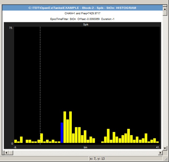
As you step through the stimulus frequencies, exploring the response pattern using the cursor, you can determine that the latency of the response shifted at the higher frequencies.
Instead of animating through the data (viewing responses to one stimulus frequency at a time) you can also look at all frequencies at once.
Plotting Frequencies Along the Y-Axis
To move frequency to the y-axis:
-
Drag the Freq (frequency) filter to the y-axis bar and ensure the check box is selected.

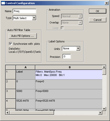
Notice that the control type changes from Step Slider to Multi Select. The x and y axes always use a Multi Select filter type, with each filter criterion representing a point along the corresponding axis. Also notice that all selection values, except one, are filtered out (shown as darkened boxes). That is because OpenExplorer maintained the filtering established when using the Step Slider (always displays only one value at a time). You can enable each selection box by clicking it on the control bar (make sure to use the scroll arrows to display all values) or you can enable all values at once in the Control Configuration dialog box.
-
Double-click the y-axis [Y] control.
-
In the spreadsheet area of the dialog box, click the Select All button TWICE. When no rows are darkened, click OK.
-
Click the 0 selection box to filter out those responses. If the 0 selection box is not in view, use the Scroll Left
 button to scroll until
it is in view.
button to scroll until
it is in view.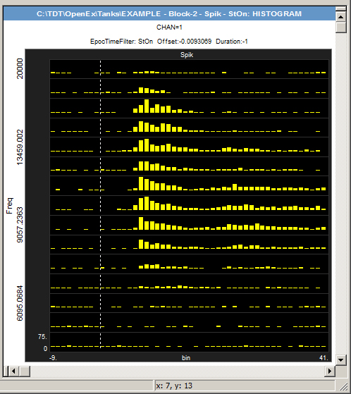
The new display facilitates a quick visual assessment to determine the frequencies with the best response (between 9 kHz and 15 kHz). Slight differences in the response are also readily apparent. For example, this data shows that the latency to onset is less at lower frequencies and that the response to lower frequencies lacks the second response seen at higher frequencies. At frequencies between 7 kHz and 14 kHz, a more bimodal distribution of neural activity can be seen. This might indicate a slower responding cell or an additional tonic response from the same cell. To explore this idea further you'll need to view the spike shapes.
Viewing the Spike Shapes
To view a cell in more detail:
-
Right-click a cell that shows the bimodal pattern clearly (such as 11041 Hz) and click View Cell Picture in a New Window on the shortcut menu.
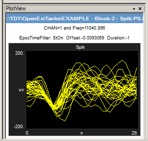
The new window displays data from the selected cell only. Viewing the shape of the waveforms represented in the histogram might help to determine if responses from more than one neuron are present.
To quickly change the plot type:
-
Right-click the new window and click Pile on the shortcut menu.
To view different data in the pile plot:
- Click a different cell in the main plot.
Tuning Curve
After exploring the response to the stimulus frequency alone, you might also want to explore the intensity response at a single frequency or multiple frequencies.
To add an intensity filter:
- Drag the Levl event from the EVENT list to the x-axis bar of the XY Axes Control and click OK.
In this data set, data acquired when no stimulus was being presented are sorted as Levl=0.
To filter out responses to Levl=0:
-
Click the 0.00 selection box.
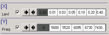
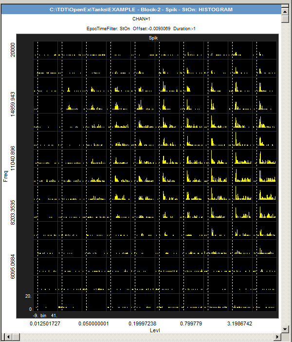
The modified plot allows you to examine the spike activity across all frequencies. By visualizing the data this way you can identify the most sensitive frequencies. However, it might be easier to visualize this by looking at an activity plot.
To quickly change the plot type:
-
Right-click the plot area and click Activity on the shortcut menu.
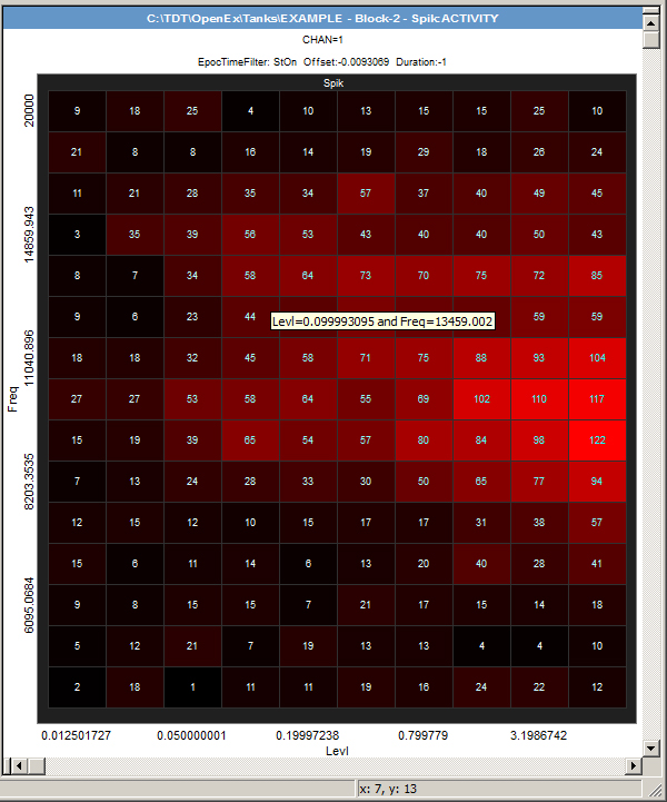
In an Activity plot each cell is colored according to the number of responses and the number of responses is displayed clearly in each cell. When you point to a cell the exact X,Y values are displayed. In this Activity plot you can immediately see that, at 13459.002 Hz, the neuron(s) responded to a 0.1 level with 44 spikes.
Rate-Intensity Curve
There are many ways to explore the relationship between the spike rate and the stimulus intensity. One way to examine each frequency across multiple intensities is to modify the Activity plot.
To modify the Activity plot:
-
Drag the Freq event from the Y-axis bar to an area below the other filters in the Control Panel.
-
Double-click the new Freq control, to display the Control Configuration.
-
Select Step Slider as the control type.
-
Click OK.
-
Drag the slider to the 5000 Hz position.
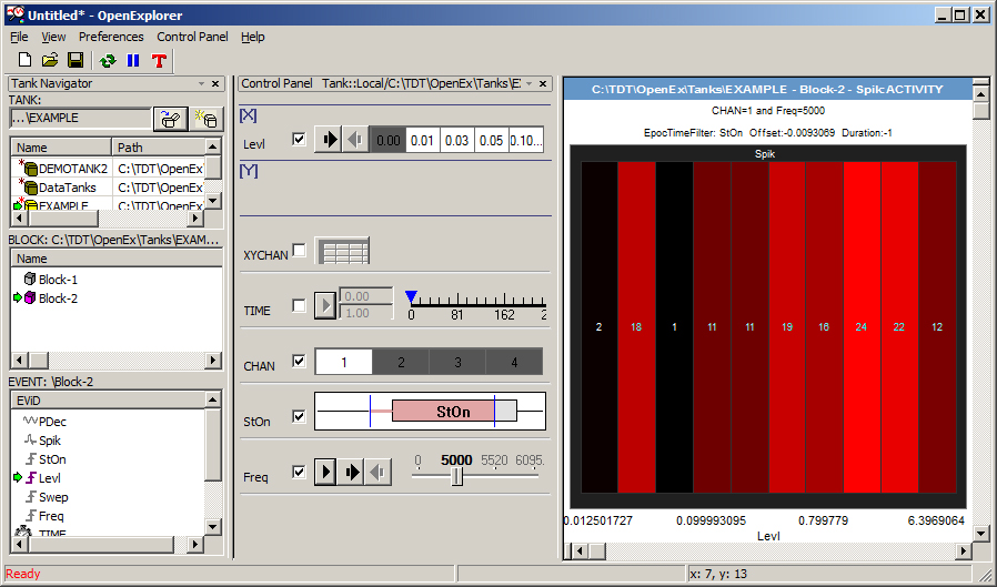
With this new plot configuration you can examine the response characteristics for each frequency or use the Play button to animate the plot through a sequence of different frequencies. In the Activity plot, the strength of the response is visually indicated by the color. In this case the strongest response is bright red while a cell with little or no response is black.
To visualize the response another way:
-
Right-click the plot and click Histogram on the shortcut menu.
-
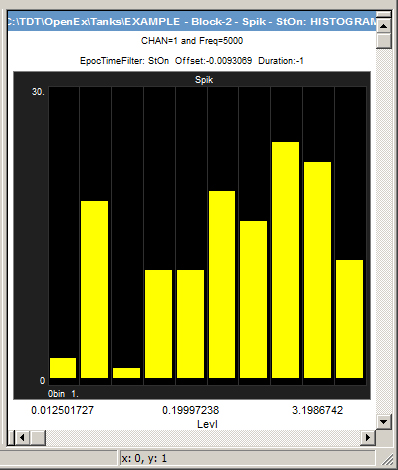
In the Setup Properties dialog box, enter .1 in the Time Span box and enter 1 in the Bin Width box. This will plot all responses at a given level in a single histogram bar.
-
Click OK.
-
Adjust the scale as needed.
-
You can step through or play through each frequency using the step slider.
Summary
In this tutorial you explored sample data using standard viewing patterns such as:
- Channel matrix
- Peri-stimulus histogram
- Tuning curve
- Rate-intensity curve
OpenExplorer was designed to provide the flexibility you need for dynamic exploration of your data. You can view the data while quickly moving from one pattern or filtering configuration to another. In addition to these powerful exploration and visualization tools, OpenExplorer also enables you to export data from any plot at any step of exploration.