Auto Tuner Example
The AutoTuner example is an excellent example of how one can visualize and then export vast quantities of data in OpenExplorer. Many neurons, or even groups of neurons, respond preferentially to a limited set of environmental stimuli. In sensory physiology, tuning curves are commonly generated to measure the sensitivity of a neuron (or population of neurons) to some sensory input, such as the orientation of a bar moving across the visual field or the frequency of an auditory signal.
This example demonstrates how the filtering capabilities of OpenExplorer can be used to determine the best frequency response of the cell, how to view histograms that incorporate both pre-stimulus and stimulus responses, and how you can view the spike characteristics to determine if there was more than one unit responding.
The Example Data
The data that will be used for the explanation is in Tank EXAMPLE, Block-1. This block contains tuning curve data from a single cell acquired on channel one.
Concepts and Techniques Illustrated
- Tuning Curve
- Peri-Stimulus Time Histogram (PSTH)
To get started, launch OpenExplorer:
- On the Start menu, select TDT Sys3, OpenEx, OpenExplorer.
To create a new configuration (*.xpr) file:
-
Click the
 New button on the toolbar.
 -
If you are prompted to save changes to the current configuration, click NO.
To select the data:
-
In the Tank Navigator, right-click and select Show Legacy Tanks.
-
Select EXAMPLE in the TANK area.
-
Under BLOCK, click Block-1.
The EVENT area of the Tank Navigator now displays a list of events in Block-1 of Tank EXAMPLE.
The Tuning Curve
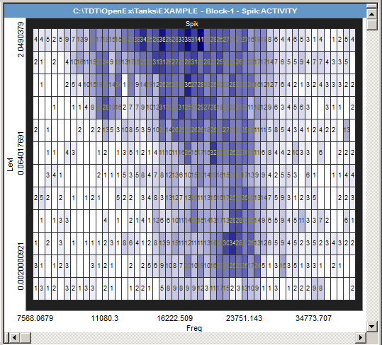
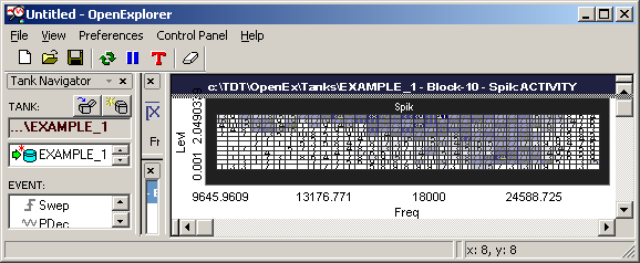
The OpenExplorer activity plot provides an excellent quick visual representation of tuning curve data. The plot is a grid divided into cells according to the X and Y controls, in this case Freq (stimulus frequency) and Levl (stimulus level). Each cell is shaded according to the number of spikes that occurred at that frequency and level. By default, the lowest spike count (0) is colored black and the highest spike count (41) is bright red. The counts in between are varying shades between the two colors. In the configuration below a number of modifications have been made to improve visualization. For the example block of data, this plot shows a tuning curve centering around 22.16 kHz.
Creating the Tuning Curve Plot
After data has been selected, a plot can be created by dragging an event to the plot area.
To add an activity plot:
-
Drag the Spik event (acquired snippets) from the event list to the plot area.
-
In the Choose Display window click Activity.
Defining the X-Axis - Freq
The x-axis is defined using the Freq (frequency) epoch event.
To define the x-axis:
-
Drag the Freq event from the Event list to the X-control area.
-
In the Control Configuration dialog box, click OK.

The X-axis portion of the XY Axis control is displayed as a sorted list of frequencies. This means that the x-axis is divided into sections based on the values of the Freq epoch, that is, the frequencies presented.
All values might not be visible simultaneously. You can use the
 Scroll buttons to scroll left or right to see the
remaining values. You can also click individual values in the row to filter out (darken)
responses for those values. In this data set, data acquired when no stimulus was being
presented is sorted as Freq=0.
Scroll buttons to scroll left or right to see the
remaining values. You can also click individual values in the row to filter out (darken)
responses for those values. In this data set, data acquired when no stimulus was being
presented is sorted as Freq=0.
To filter out the Freq=0 responses:
- Click the 0 selection box on the x-axis Freq control.
Defining the Y-Axis - Levl
The y-axis is defined using the Levl (level) epoch event.
To define the y-axis:
-
Drag the Levl event from the Event list to the Y-control bar.
-
In the Control Configuration dialog box, click OK.

Like the X-control, the Y-control is displayed as a row of values that can be included or removed. In this case, the row of values is a sorted list of level, or amplitude, values at which the stimuli were presented. This means that the y-axis of each plot is divided into sections based on the different values of the Levl epoch, that is, the stimulus levels presented. Again, in this data set, responses acquired when no stimulus was being presented were sorted as Levl=0.000.
To filter out the Levl=0.000 responses:
- Click the 0.000 selection box on the y-axis Levl control.
Reducing the Visibility of Noise in the Tuning Curve
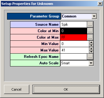
By default, the activity plot varies in color intensity from red to black. However, the color and min/max settings can be modified to improve visualization.
-
Double-click the activity plot to display the plot's property settings.
-
Click the
 Look Up button next to Color at Min.
 -
Select white in the color palette window, and click OK.
-
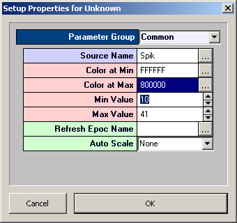
Click the
Look Up button next to Color at Max. -
Select dark blue in the color palette window, and click OK.
-
Set Auto Scale to None.
-
In the Min Value box, enter 10.
-
Click OK.
All cells with spike numbers less than 10 are now colored white, reducing the visibility of noise in the tuning curve. The frequencies of interest can now be quickly identified.
Filtering the Data
OpenExplorer provides many ways to filter data. Earlier you filtered out the 0 level and 0 frequency data by simply clicking the corresponding selection box on the control. Text filters provide another way to quickly implement arbitrary filters.
To add a text filter:
-
Click in the Text Filter Conditions Box.
-
Type Freq>9000 and Freq<35000.
-
Press the Enter key.
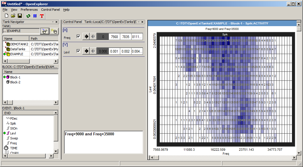
The extreme areas on the left and right sides of the multi-cell plots are now empty. Frequencies below 9000 Hz and above 35000 Hz have been filtered out giving the figure a cleaner look. Notice, however, that only the responses at those frequencies have been removed from the plot, not the cells themselves. As long as those frequencies are enabled in the x-control, the cells will remain in the figure. A label has been added to the plot to indicate that a filter has been applied.
To remove the text filter:
-
Select the text in the text entry area.
-
Press the Delete key.
-
Press the Enter key.
You can remove the cells as well as the data by modifying the x-axis.
To modify the x-axis:
-
Double-click the x-axis control bar.
-
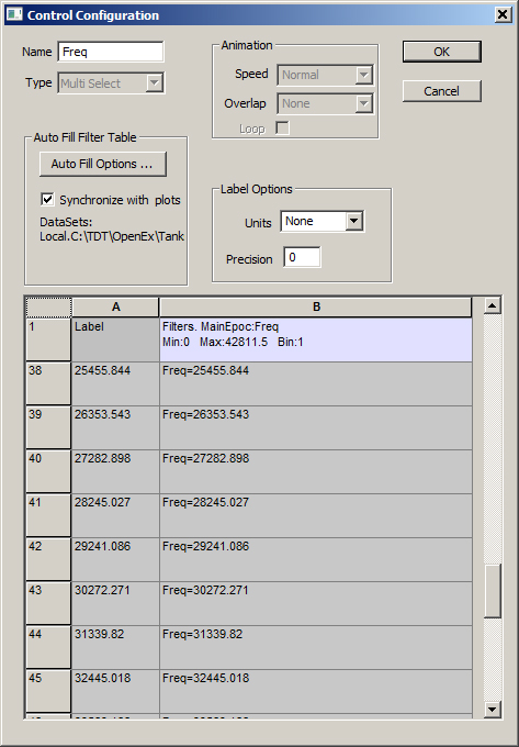
In the Control Configuration dialog box, click the Select All button twice.
-
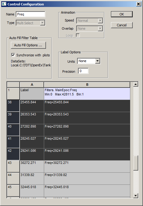
In the spreadsheet, select rows 10 through 42.
-
Click OK.
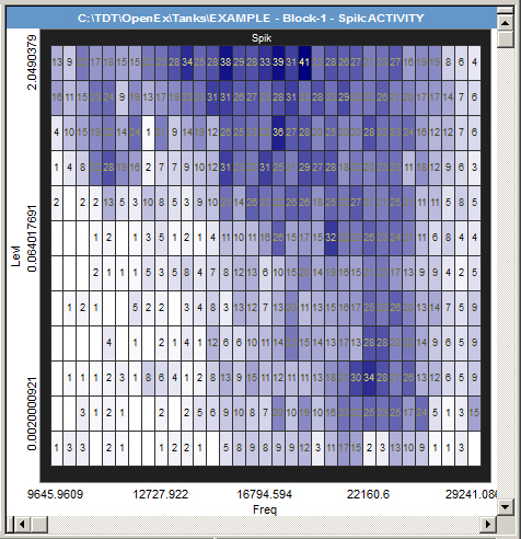
The x-axis has been updated so that the plot shows only the data of interest.
Exporting the Tuning Curve Data
At any point during data exploration, you can export the plot data.
To export the Tuning Curve data from the current activity plot:
-
Right-click the activity plot.
-
Click Export Plot Data on the shortcut menu.
-
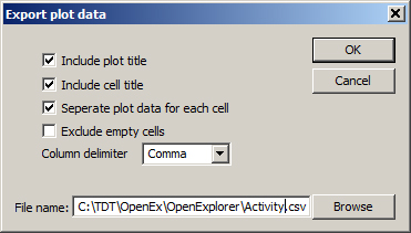
In the Export Plot Data dialog box, enter (or browse to) a location and file name.
-
Click OK.
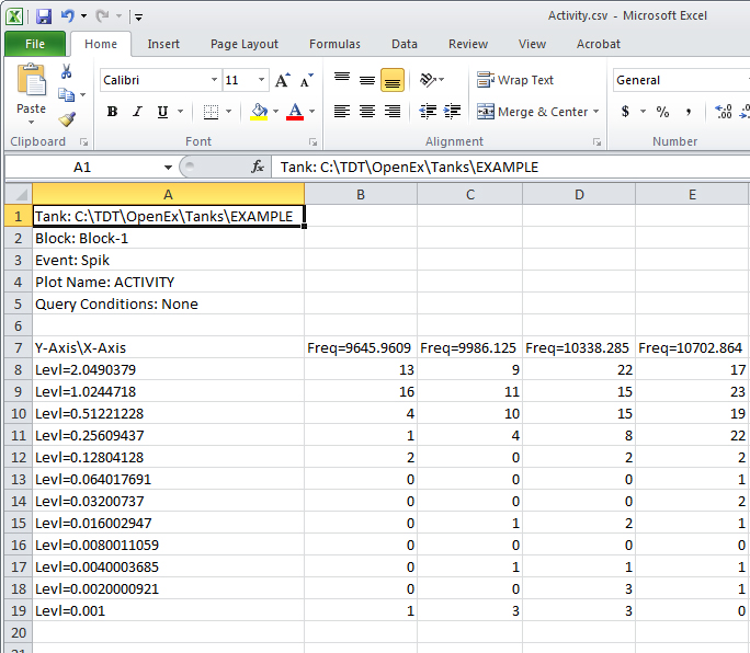
The resulting CSV format file can be opened in Microsoft Excel. The file includes header information, such as the Tank name and block number, event name, plot type, and any arbitrary filters that have been applied. The exported data for the activity plot includes the spike count at each X,Y position in the plot.
Animating the Tuning Curve
The response of a cell often changes as a function of time. Animating a plot can help you quickly identify time-related changes in cell response such as fatigue, adaptation, or subject boredom. Using the standard Time event and a Continuous type control you can quickly create a control that will enable you to view a series of time line segments. As each segment is animated, only events that take place during the defined time duration are plotted. This type of animation facilitates the detection of changes in the overall response of a cell over time.
To animate the plots:
-
Drag the Time event from the Event list to an empty area of the Control Panel.
-
In the Control Configuration window, select Continuous in the Type box and click OK.
-
A timeline will appear in the control area. It includes two value entry boxes, one for start time (top) and one for the duration of the time segment (bottom) in view. You can type values in each box. You can also drag the blue arrowhead to specify a start time. The area on the timeline selected will be highlighted in yellow.

-
Enter a duration in the lower text entry box to define a duration or time segment.
-
Click the
 Play button to begin animation.
To halt the animation:
- Click the
 Pause button.
When you want to view all data you need to remove or disable the Time filter control.
To disable the Time filter:
- Clear the check box to the right of the control label.
Viewing the Response Over Time
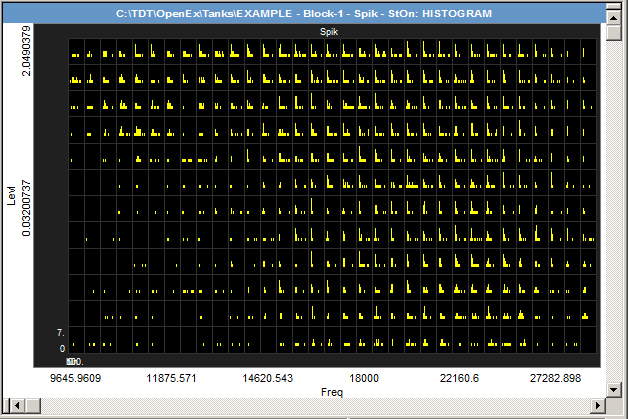
Histograms provide another way to look at responses over time. They plot time stamped values in relation to some defined zero reference. The OpenExplorer histogram plot is also a grid of cells and is formed using the same X and Y controls, in this case Freq (stimulus frequency) and Levl (stimulus level), used for the activity plot. Each cell contains a histogram of spikes recorded at a given frequency and level. The histograms are plotted with StOn (stimulus onset) as the reference epoch. This means that the zero reference of each histogram is the onset of the stimulus onset (StOn) epoch and the duration of the histogram is the time from one StOn onset to the next (about 100 ms).
Creating the Histogram Plot
To add the histogram plot:
-
Drag the pane divider bar down to subdivide the plot area.
-
Drag the Spik event (acquired snippets) from the event list to the empty plot area.
-
In the Choose Display window, select Histogram.
-
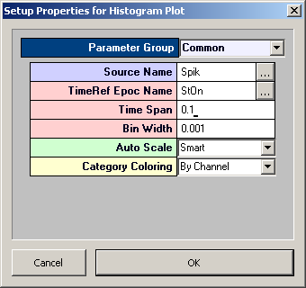
In the Setup Properties dialog box, ensure that StOn is selected as the reference epoch (TimeRef Epoc Name box).
-
Enter .1 in the Time Span box.
-
Click OK.
The plot is generated using the onset of StOn as the zero reference and a bin size of one ms.
Viewing the Contents of a Cell
When a multi-cellular plot is built, the size of each individual cell depends on the number of values present in the X and Y controls of the plot. If the number of X and Y values is small, it is easy to view the contents of each cell. If there are many X and Y values, however, the individual cells become too small to give anything but an overview of the response over the stimulus set. Because the plot for this data set includes many cells, the cell contents are difficult to view.
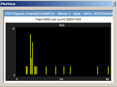
To view the data in each cell in more detail, you can plot an individual cell in a new window. A neat aspect of this feature is that the new window will display the contents of whichever cell you click in the main plot area, which reduces the need to create multiple windows to view different cells.
To view a cell in a new plot window:
-
Right-click a cell in the Histogram plot.
-
Click View cell picture in a new window on the shortcut menu.
A new sub-window is opened and the contents of the selected cell are displayed. By default, the window is added below the control panel. The window can be collapsed, expanded, or floated. Multiple windows can be opened and each window can be dynamically updated from one plot type to another.
Using the Cursor
The new window provides a better view of the responses in the selected cell. OpenExplorer includes a cursor feature that you can use to more precisely determine when the response occurs.
To use the cursor:
-
Press and hold down the Ctrl key and drag across the histogram.
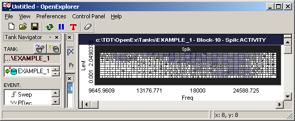
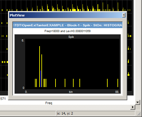
As you drag, the histogram bar under the pointer will turn from yellow to blue. This allows you to visually select a bar. The x,y value for the selected bar is displayed in the Explorer Status bar.
Using the cursor you can determine that (for Freq=22160.6) the response onset occurs at around 14 milliseconds (X=14).
Viewing the Spike Shapes
There are many times when you might want to see the shape of spikes in a particular cell. OpenExplorer makes it easy to dynamically change plot types.
To view a cell in a new window using a different plot type:
-
Right-click the multi-cell histogram plot.
-
Select Pile on the shortcut menu. All the cells in the plot will now become pile plots.
-
Right-click a cell and select View cell picture in a new window, on the shortcut menu. This will open another window with a picture of that cell, this time as a pile plot.
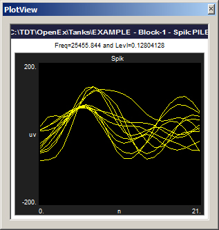
Notice that the earlier "new" window will remain as a histogram plot of the selected cell. Now when you click different cells in the multi-cell plot, the two cell windows will refresh accordingly, one as a histogram plot and one as a pile plot of the selected cell. In other words, the cell plots are frozen to their respective plot types, but not to a cell. You can freeze a new plot to a cell using the Freeze plot command on the shortcut menu.
Including Pre-Stimulus Data
In this configuration, the basic histogram plot uses the stimulus onset as a time reference epoch to plot spike responses. This means that only spikes that occur after stimulus onset are included. When viewing data in a histogram it is often desirable to plot the pre-stimulus spikes along with the spikes acquired during the stimulus. In order to do this, you must filter the data to include spikes that occurred within a time window that starts from a point before the onset of the stimulus to a point after that onset. The Adjust Epoch control makes this type of filtering easy by allowing you to specify a start time and duration with reference to the onset of an epoch. After the control has been configured, you can change these values dynamically to view histograms with different zero references.
To add an epoch as a time reference filter:
-
Drag the StOn (stimulus onset) epoch event from the Event list to an empty area of the Control Panel.
-
In the Control Configuration dialog box, select Adjust epoch in the Type box and click OK.
The StOn control is displayed in the control area. The pink bar represents the duration of the epoch. Two vertical blue bars can be moved along the horizontal axis. Double-clicking the control will open a window that allows you to enter an adjusted offset and duration.

Note
The duration cannot be longer than the duration of the epoch event.
-
To specify these values visually, drag the bars using the mouse. This applies a filter based on the offset and the duration.

Adjust these values dynamically to explore the data, including responses before stimulus onset.
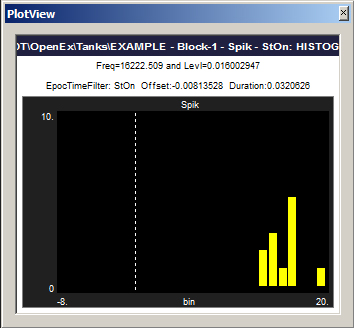
Notice that a dotted vertical line appears in the histogram in the new plot window and that the x-axis starts from a negative number. The vertical line is the zero line, in this case the onset of the stimulus. Because the cells in the main histogram plot are so small the zero line might not be displayed. When possible the zero line is added to all affected histograms.
Exporting the PSTH Data
Earlier you exported plot data from the Activity plot. All plot types support export; however, data in the resulting file will be arranged differently according to the plot type.
To export the PSTH data from the current histogram plot:
-
Right-click the histogram plot.
-
Click Export Plot Data on the shortcut menu.
-
In the Export Plot Data dialog box enter (or browse to) a location and file name.
-
Click OK.
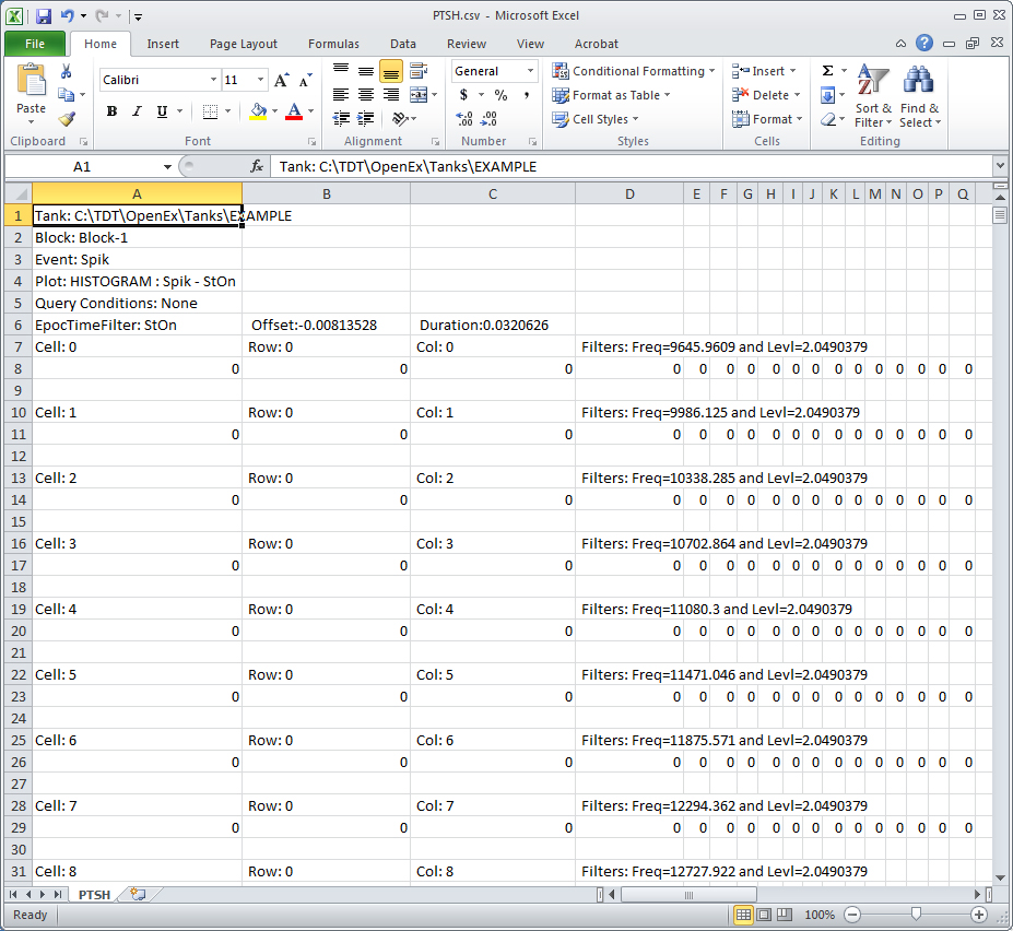
The resulting CSV format file can be opened in Microsoft Excel. The file includes header information, such as the Tank name and block number, event name, plot type, and information about the time offset and duration. The exported data for the histogram plot includes two rows for each cell in the plot. The first row includes information about the cell including the X and Y value (reported as a filter). The second row includes the spike count for each bin of the histogram for that cell.