Creating Plots
About Plotting
OpenExplorer plots display the selected tank data after user-defined filters have been applied. Because filters can be applied and modified dynamically using TTank's powerful data sorting algorithms, OpenExplorer plots allow for dynamic analysis of stored data. When analysis is complete the plot can also be used to export data subsets or images.
Creating a Plot
Before a plot can be created the data must be selected using the Tank Navigator.
To create a plot:
-
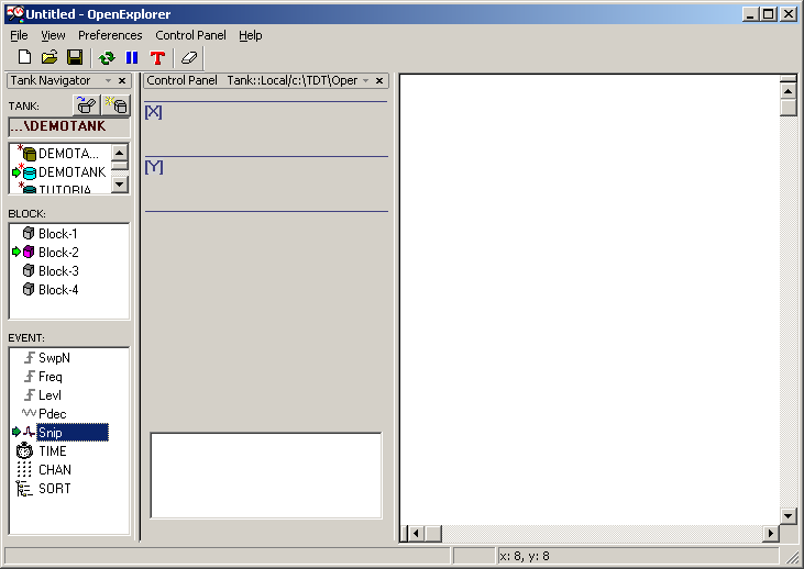
Drag the desired event to the plot area.
-
A window will open allowing you to select the desired plot type.
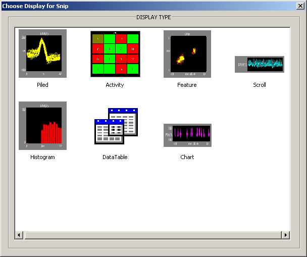
Only plot types that are valid for the data will be displayed.
-
The plot will be generated using default values for properties such as appearance and behavior. If a property (such as reference epoch) must be defined before the plot can be displayed, the setup properties dialog box will open automatically.
Note
All data will be plotted in a single cell until the X and Y axes are configured.
Configuring the X and Y Axes
The XY Axis control is a special type of filter that is always included in the Control Panel; however, users must configure this control by assigning a standard or stored scalar event for each axis.
To define the x or y axis:
-
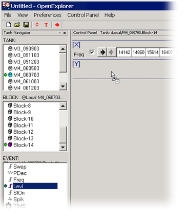
Drag the desired event to the [X] or [Y] bar in the Control Panel.
-
A configuration window is opened. In the Control Configuration window, you can modify settings such as the display precision, text label, and values to be included. To learn more about the configuration options see Control Configuration Dialog Box.
-
Click OK.
Using the X and Y Axes to Filter Data
The XY Axis control is automatically configured as a multi-select filter. This gives the user a great deal of control over exactly what data is displayed. Using the control, users can select specific values to include or exclude in the XY Axis configuration, view a specific range of values, group values in linear or logarithmic bins, or create custom groupings using logical operators in text based filters.
Warning
Always keep in mind that the multi-select control type is limited to 100 selections. If the desired event includes more than 100 values, by default, the first 100 values will be used.
Creating the XY Grid Using a Single Event
A single event can be split across the x and y axes. CHAN, for example, is a standard event that stores the acquisition channel number associated with each event in the tank. Chan can be split across the x and y axes to represent electrode array geometry. This can be accomplished by dragging the event to the border between [X] and [Y] or using the Add XY Axis Control command on the Control Panel menu.
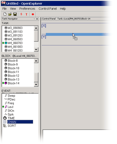
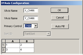
The XY Axis Configuration dialog box provides additional control over the arrangement of values. In the XY Axis Configuration dialog box you can type a label for the x and y axes and select the event from the Primary drop-down menu. A spreadsheet-like grid is automatically generated based on the selected event. The cell values can be edited by typing directly in the cells; however, no error checking is provided. The user must ensure that a valid value is entered.
Note
This dialog box is available from the Add XY Axis Control command on the Control Panel menu.
The grid geometry can be changed in the Auto Fill Configuration, which is available from the Auto Fill button.
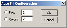
To change the number of rows or columns, type the new value in the corresponding box and click OK.
Working with Plots
The plot area allows the researcher to visualize trends and relationships in a data set by displaying the selected data in a user specified plot type. The plot area provides flexible display tools and a variety of customization options to meet the researcher's needs. Users can modify the properties of the current plot, divide the plot area to view the data using multiple plot types, or even launch new windows to examine the data in a particular cell more closely. This level of customization provides the researcher with a flexible canvas for data exploration and display.
The Display Area
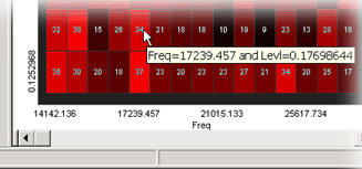
The data set and any filters applied are displayed along the top edge of the plot area and responses are grouped into cells according to the user defined x and y axes. The exact x and y values for a particular cell are displayed when the user hovers the pointer over the cell. Most plot types also support the use of a cursor within a cell.
Plot Scaling
Plots can be scaled manually or using an auto scale feature.
- To scale a plot manually, hold down the shift key and drag the pointer up or down to adjust the plot scale.
There are three auto scale settings:
None: auto scale is turned off.
Active: the scale of the plot is automatically adjusted to ensure all values can be shown on the plot.
Smart: the scale of the plot is automatically adjusted to ensure values can be shown on the plot only during the first 3 seconds.
These settings are available in the plot setup properties dialog box. The default setting varies across plot types.
Modifying Plot Properties
Many aspects of the plot's appearance, such as axis labels, fonts, plot line width, margins, and colors are part of the plot's setup properties.
- To modify a plot's properties, double-click the plot area.
This opens the setup properties dialog box, which contains all of the customizable settings for a selected plot.
Reversing the Axis
After a plot has been configured with the desired data and filtering properties, users can change the order (ascending or descending) of values along the x or y axis.
- To reverse the order of values, right-click the plot and select X Axis Reversed or Y Axis Reversed on the shortcut menu.
Changing Plot Types Dynamically
After a plot has been configured with the desired data and filtering properties, users can change the plot type quickly and easily.
- To change the plot type, right-click the plot and select a new plot type from the shortcut menu.
Subdividing the Plot Area
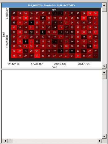
OpenExplorer is not limited to displaying a single data plot. Users who want to view the same data in several different types of plots at the same time or view several different data events plotted at the same time can subdivide the plot area. The plot area can be divided by dragging the small pane divider bars found at the top right or bottom left corners.
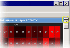
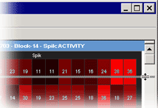
Users can drag a data event from the event list to fill the newly created plot area.
Note
While the event and plot type can be different in each plot area, the x and y axes selections and all filters are applied to all plots.
Plot Types
OpenExplorer includes eight customizable plot types.
Note
Not all plot types can be used with all types of data.
Activity
Activity plots are used to view the amount of spike (or other) activity occurring. Activity plots make it easy to view spike counts or to compare spike rates between acquisition channels. Users can define the minimum and maximum value to be displayed and assign a color to minimum and maximum. As the plot is animated the color of an activity cell varies in intensity across a range corresponding to the minimum and maximum defined values.
Piled
Pile plots are designed to visualize small data buffers (<500) for quick recognition of differences in waveform properties. Pile plots are commonly used when extracellular recordings from neurons are examined to separate out single-unit activity. Users can use pile plots to view time stamped buffers, called snippets, or synchronized buffers. Waveforms are layered over one another and centered along the x-axis. As the buffers pile up, differences in the shape of the waveforms can easily be distinguished.
Histogram
Histograms use time stamped values from a variety of data stores for graphic presentation. The most common of these are snippets, but lists and even scalars can be included as long as a time stamp is part of the acquired value. Users can set up the bin size (size of time divisions for sorting the time stamps) and the parameters for refreshing the plot.
XY
XY plots provide a useful means of looking at changes in two continuously varying values. The y-axis and the x-axis, within each cell of the larger plot, are selected from available data events. The XY plot can be used to plot positional information such as XY coordinates for an animal moving in a tank or it can be used to plot data from an eye or head tracker.
Feature
Feature plots compare two waveform properties, such as the first and second peak voltages of two candidate spikes. They are ideal for determining how many unique waveforms are present in a signal. X-axis and y-axis features can be selected from a drop down list in the setup properties dialog box.
In OpenExplorer the feature plot has been designed for examining patterns of spike waveforms. The plot works best when viewing snippet data. Although other waveforms can be viewed, plotting complex waveforms with many points will require intensive amounts of computer time.
Scroll
Scroll plots provide a useful means of looking at continuous data. Data is presented in segments called scrolls. Looking at one scroll after another gives an effect similar to an oscilloscope or EKG. Within each scroll plot cell the y-axis is voltage and the x-axis is the record size.
Chart
Chart plots are an excellent way of graphing time stamped waveform data such as spike snippets. The chart plot shows the snippet waveform and its exact position in the block of data. Within each cell the y-axis is voltage and the x-axis is time in seconds. When the scale of the x-axis is contracted, the position of a snippet along the x-axis clearly identifies when in time the snippets occurred and patterns of occurrence over time are emphasized. As the scale of the x-axis is expanded, the shape of the waveform becomes more visible.
Data Table
The Data Table displays data in a tabular format and provides a variety of tools and export features unique to this plot type. Data can be cut and pasted to other applications, exported in a text format, or further filtered. The Data Table also provides Find and Mark features to make it easier to work with large data sets in this format.
Exploring a Cell
An OpenExplorer plot is generated by creating a cell for each X and Y value along the axes. In an activity plot each cell contains a simple count of spikes for that XY coordinate. Other plot types display, in effect, a plot within a plot. When the histogram plot type is selected, for example, each cell contains a histogram of the values at that XY coordinate. The number of cells depends upon the number of X and Y values. Whether your plot contains a single cell or many cells, OpenExplorer enables you to further explore the data in each cell.
Using a Cursor
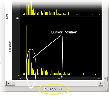
Within a cell, a cursor can be implemented by holding down the control key and moving the pointer across the waveform or histogram. The X and Y coordinates will be displayed in the status bar along the bottom edge of the OpenExplorer window.
Opening a Cell in a New Window
When a multi-cellular plot contains many cells the individual cells become too small to give anything but an overview of the response over the stimulus set. To view the data in each cell in more detail, users can plot the contents of an individual cell in a new window. Multiple new windows can be opened. This allows you to compare a single cell using multiple plot types or to compare multiple cells. Each window is labeled with data source and filtering information.
To open a cell in a new window:
- Right-click the cell and click View cell picture in a new window on the shortcut menu.
Viewing a Different Cell in the New Window
The new window will display data from the currently selected cell. The plot type in the new window can be changed from a shortcut (right-click) menu.
To explore the data in a different cell:
- Click the new cell in the main plot. The new window will be updated with the data from the newly selected cell.
Note
Changes to the main plot, such as new or different filters, are not reflected in the new window. To update the window, click the cell again.
Freezing a Cell Window
To lock the new window to the current data:
- Right-click the new window and click Freeze plot on the shortcut menu.
The new window will be frozen or latched to the current data. Clicking a new cell will have no effect.